
More than just rows and columns
When feedback pointed to poor readability and cramped layouts, the objective was clear: make data simple, accessible, and visually consistent. The redesign improves contrast, spacing, and legibility, creating a table that feels lighter, more flexible, and finally easy to use.
Exploring the issue
It started with patterns - feedback, complaints, and inconsistencies across our tables. To really hone into this I:
Audited tables across the product to identify patterns, inconsistencies, and pain point.
Gathered internal and external feedback to understand what wasn’t working - small text, tight spacing, buddy behaviours.
Reviewed other design systems to better understand how they structure their table components to make it easy to use and readable.
Explored other products like Google, Notion, and Microsoft that are table heavy to understand common behaviours and patterns.
and with this, I got started on my exploration. Here’s a look at the Figma file. It went beyond this.
“The print is so small and it’s hard to read when everything is squished together. I have to go blind trying to figure out which data is missing.” - one of our table haters
The fun stuff
Simple on purpose. Just enough variants to handle any scenario - without making designers overthink or engineers overbuild.
Building for real use
Replaced buggy checkbox actions with a clean, connected action bar.
Single or bulk, it just works.
Fast, consistent, and familiar.
Refining the experience
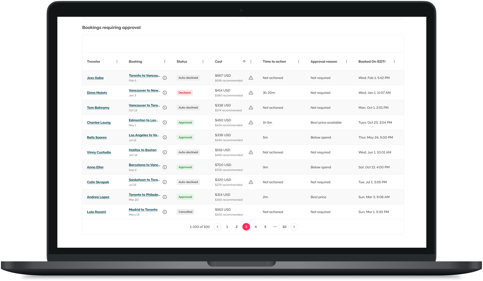
Readable beats minimal.
Alternating rows, bold headers, balanced spacing - clarity at a glance.
Kept the quirky column search because people love it.
Flexibility, unlocked
Hide what you don’t need.
Move what you do.
Personal, flexible, and built for any data load.
A better table, plain & simple
A table that’s actually enjoyable to use.
Cleaner, smarter, accessible - the backbone of our data just got a glow-up.
and… our users describe it as intuitive to use!