

"How do I download my invoice?" The question of the day.
Invoice retrieval was one of our top support tickets. But the blocker wasn't generating invoices. It was access.
Travellers couldn't download invoices in-app at all. They had to wait for an email, or ask their travel manager and wait some more. So we set a target: a self-serve invoices hub, living right inside the traveller's account, with one-click download.
I hate looking for invoices.
A not-so-happy clientYears of complaints, three clear patterns.
Partnering with UX Research, I dug through years of feedback (Qualtrics surveys, email threads, support logs), then sat down with travellers, arrangers, and admins. Three insights kept rising to the top, and they shaped everything that followed.
- Reconcile fastAdmins need a quick way to confirm and reconcile details.
- Key info at a glanceEveryone wants totals, names, and dates, without digging.
- One stop, not a huntUsers expect a single hub, not a scavenger hunt through email or a ping to their travel manager.
From rough concepts to refined flows.
Each iteration, shaped by stakeholder and design reviews, pushed toward something cleaner and more accessible. The early sketches were messy; that's the point of early sketches.
The goals were simple to say and harder to earn: create multiple access points for travellers, and make invoice data easy to scan at a glance, with the flexibility to dive deeper when someone actually needed it.
My first idea was too clever.
Clicking an invoice number opened a slide-out drawer with full line-item details and a PDF download. It looked great. But was it necessary? Why add a click (and extra engineering) just to be clever? Why not put more detail in the table itself?
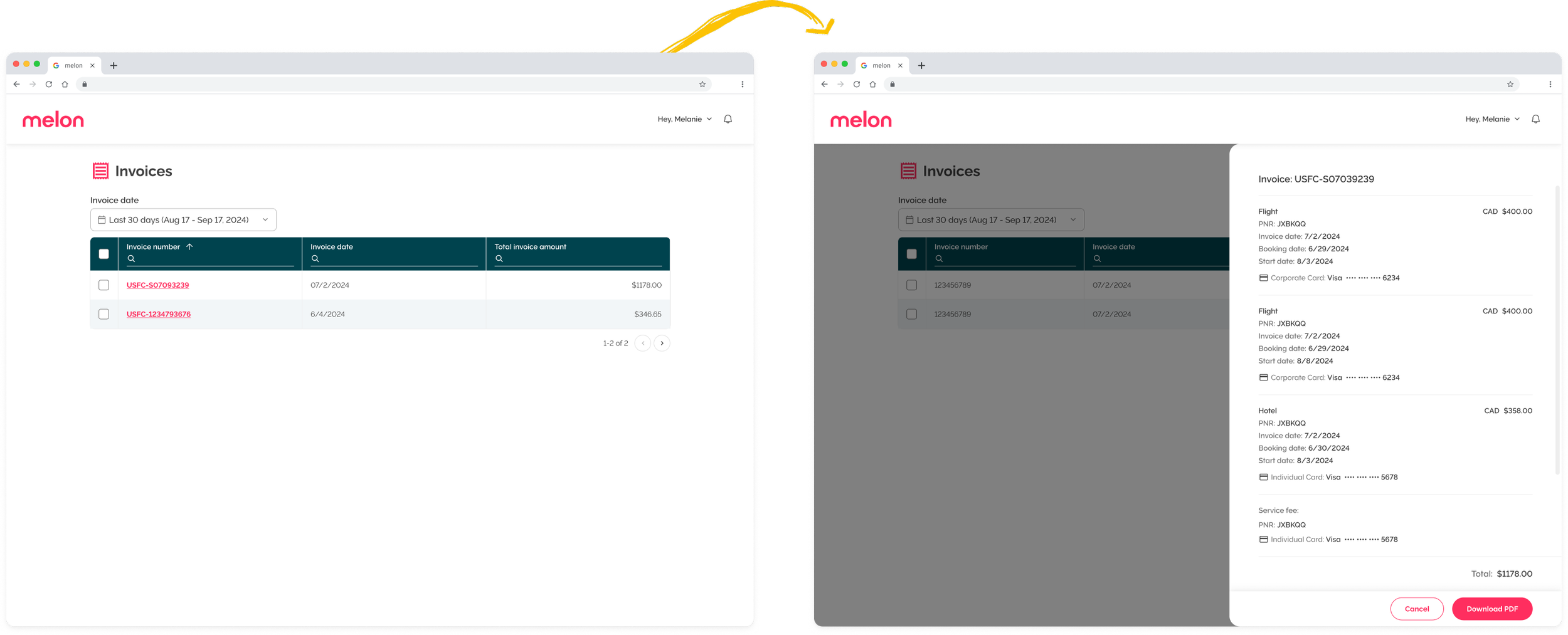
Why be clever when you can just be clear?
The question that killed the drawerTwo clicks, zero cleverness.
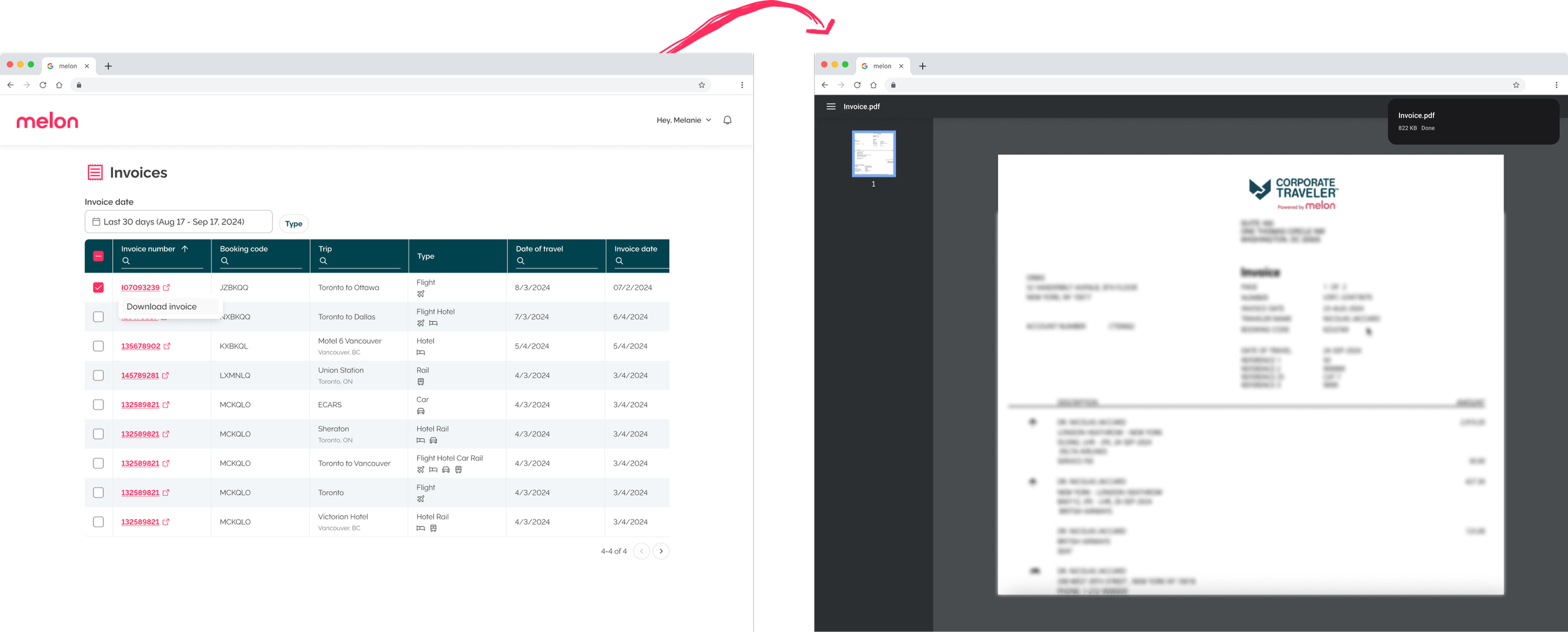
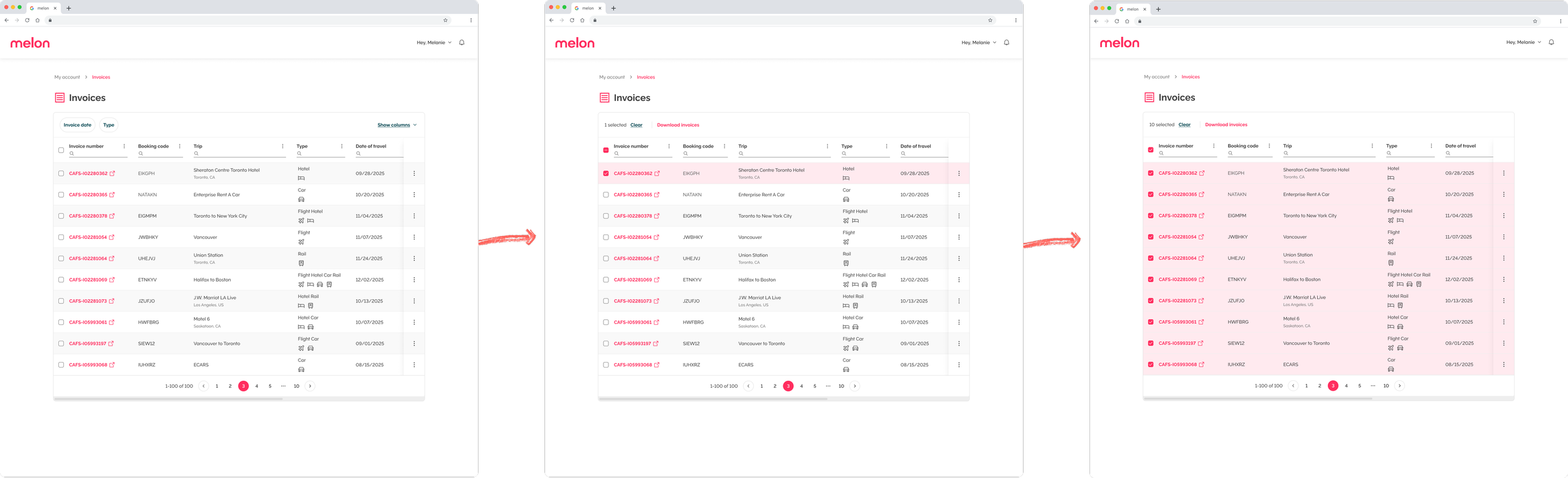
So I put the detail straight into the table and removed the extra step, solving access two ways:
- Checkbox → downloadTicking a row downloads that invoice directly. No drawer, no detour.
- Invoice number → previewClicking it opens the invoice in a new tab with a PDF preview, ready to download from there. Standard, predictable, boring, in the best way.
Invoices are data-heavy, but they can still delight. When our new table component launched, it was the perfect fit: clearer hierarchy, better readability, and more invoice data at a glance.
A routine task, made faster and quieter.
This project leaned more on data than UI, and that was the lesson. Even the most functional experiences can feel delightful when you surface the right thing at the right moment. We turned a recurring frustration into a one-click habit.
Even invoices deserve a little delight.
Note to self