
Offtryp
A better way to prepare for travel
Offtryp is an Italy based travel company that offers an online experience for travellers to fully customize their trip by selecting their destination, attractions, and more. The travel experts take care of the rest and provide a full itinerary in a matter of days.
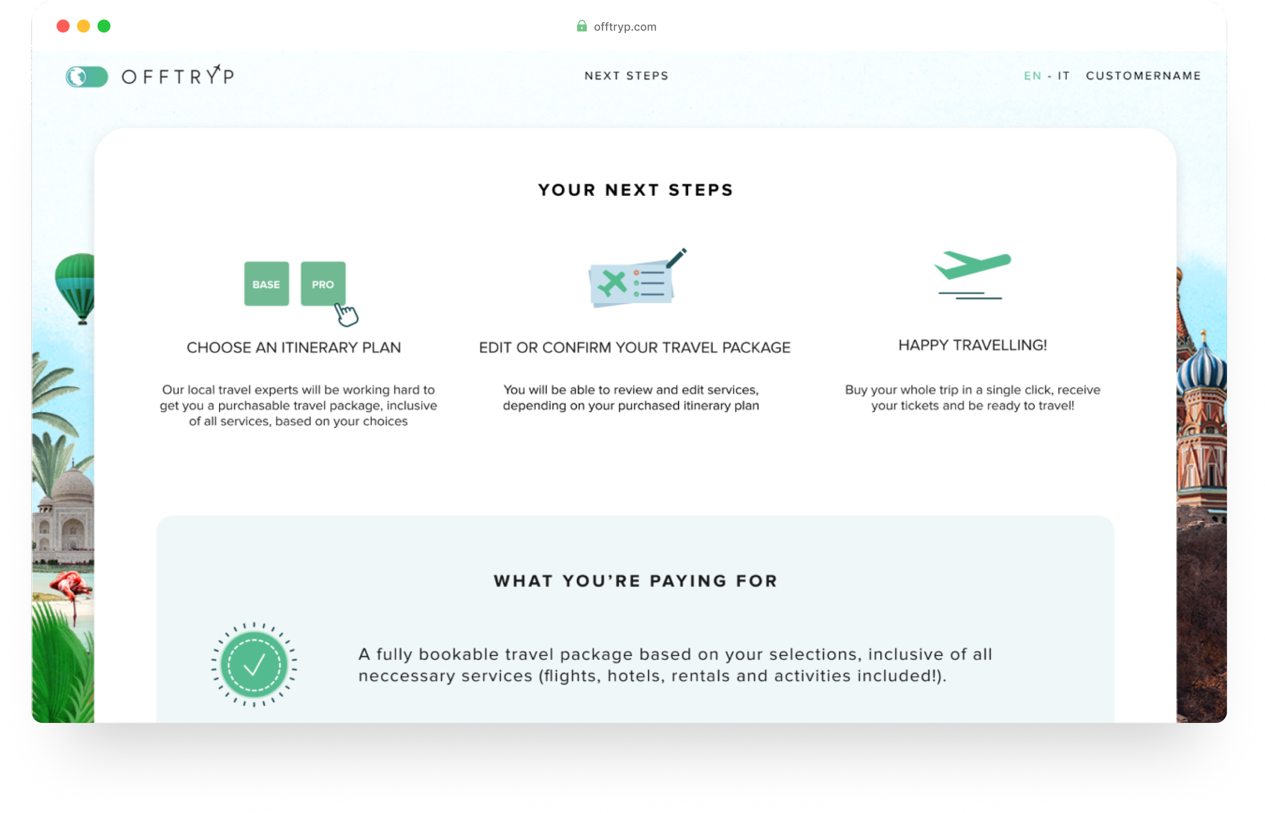
Once the customers are finished with creating their trip, they then have to select between two itinerary plans which is where customers are getting confused. It’s not made entirely clear what this is for or why this is a necessary purchase.
The Problem
The Goal
Create a redesigned checkout that increases understanding of what the customers are purchasing and set the expectation of what happens next to increase customer conversion
Understanding the Problem
After really trying to understand the real issue by going through the existing flow and asking questions, I began to see how crucial it was to come up with a design that really communicated what was going to happen next when purchasing the itinerary. I was able to find the main problems that may be causing confusion for customers.
Designing the Solution
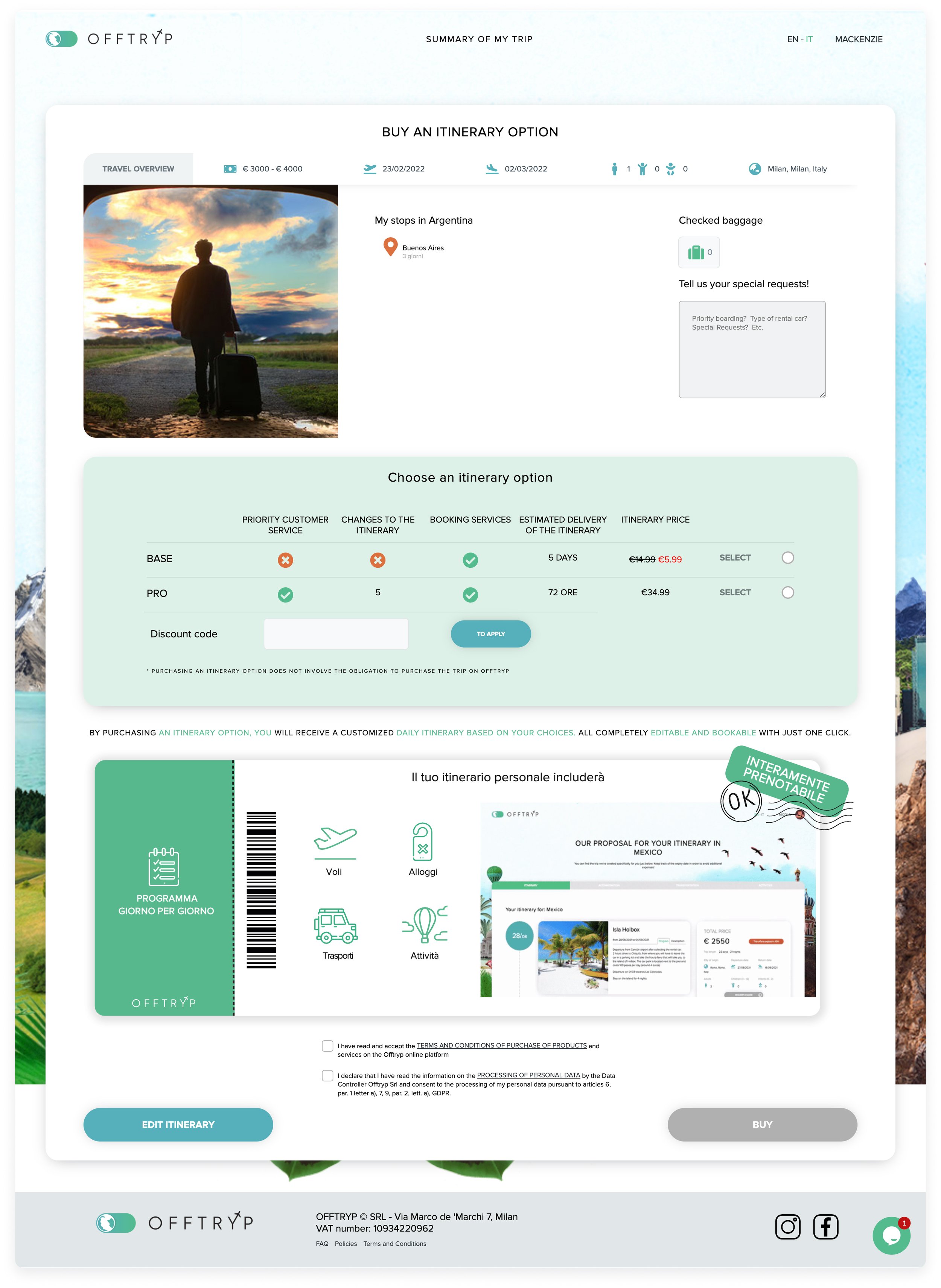
After review and pointing out the issues and potential fixed, I explored different layout options, the itinerary section being the most important. After discussing the two versions with the Offtryp team, we decided that version 1 would be the best choice to proceed with in terms of the itinerary section. We felt that the layout would be the best because it created separation between the two itinerary options and gives us the opportunity to add more information about the plans.

After receiving more feedback about the previous wireframes for the services and stops section, I decided that moving this into a modal would be best. I realized that separating it would create a better experience. I began to explore what the modal might look like. Creating the modal allow the customers to have their full focus on being sure their selections are exactly what they want.
The following screen in the flow is devoted to the itinerary option page. This left me lots of room to provide visuals and explanations. After further feedback and some shuffling of sections, I was able to design a final product for the modal and the final screen. Working with a brand that has already established their own online identity was a challenge on its own because I needed to be sure I maintain those guidelines.
What I’ve Learned
When the design became live in early 2022, customer conversions increased by 20%! While I successful in meeting the final goal, there was still a lot of learning through this process in order to get there.
I had to really put myself in a customer’s shoes. In my first initial meeting with Offtryp, I was asked if I was a traveller. To be honest, I’m not much of one. I knew that this could be a challenge. It’s an entire different customer experience and flow. I had to rely on my intuition and feedback from Offtryp, as I didn't have the capacity for research. I really had to advocate for my ideas in order to earn the trust of the team. Lastly, I’ve really learned how important it is to understand that even one small step can make it our break it. Even though I was designing a couple screens, I had to see it as something much more than just that. It translated to understanding which then lead to conversions for Offtryp.