
It started with patterns.
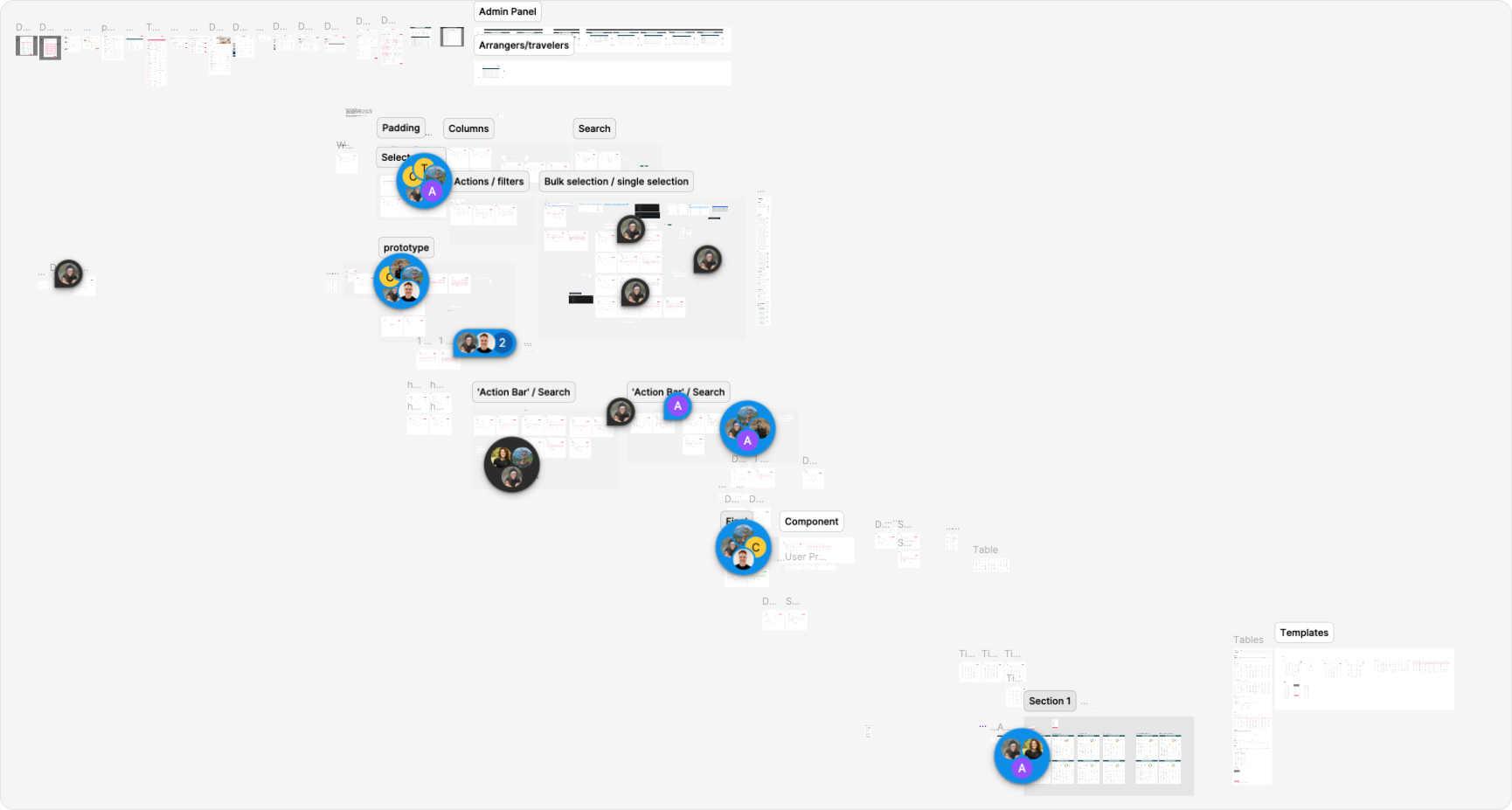
Feedback, complaints, and inconsistencies kept showing up across our tables. To really hone in on the problem, I dug in from a few angles.
- Audited our own tablesMapped every table across the product to surface patterns, inconsistencies, and pain points.
- Gathered internal & external feedbackSmall text, tight spacing, and buggy behaviours came up again and again.
- Reviewed other design systemsStudied how mature systems structure their table components for clarity and reuse.
- Explored table-heavy productsGoogle, Notion, and Microsoft, to learn the patterns people already expect.
The print is so small and it's hard to read when everything is squished together. I have to go blind trying to figure out which data is missing.
One of our table hatersSimple on purpose.
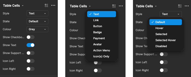
Just enough variants to handle any scenario, without making designers overthink or engineers overbuild. One flexible table-cell component covers every style, text, link, button, badge, payment, avatar, action menu, icon-only, with default, hover, selected, and disabled states behind each.
Built for real use.
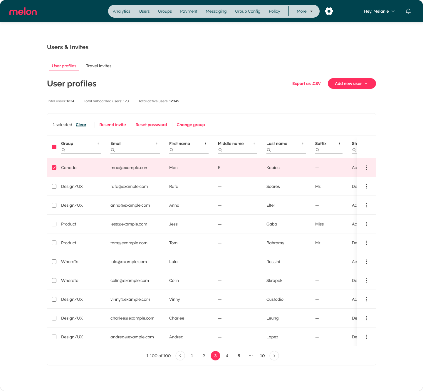
I replaced the buggy checkbox actions with a clean, connected action bar. Single or bulk, it just works, fast, consistent, and familiar.
Readable beats minimal.
Alternating rows, bold headers, and balanced spacing make for clarity at a glance. And I kept the quirky per-column search, because people love it.
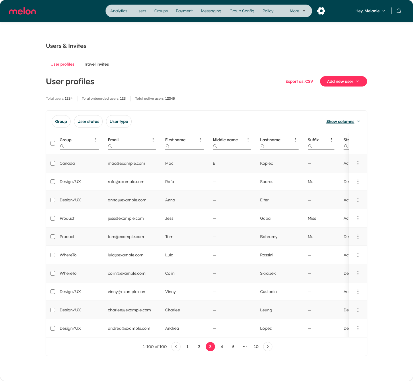
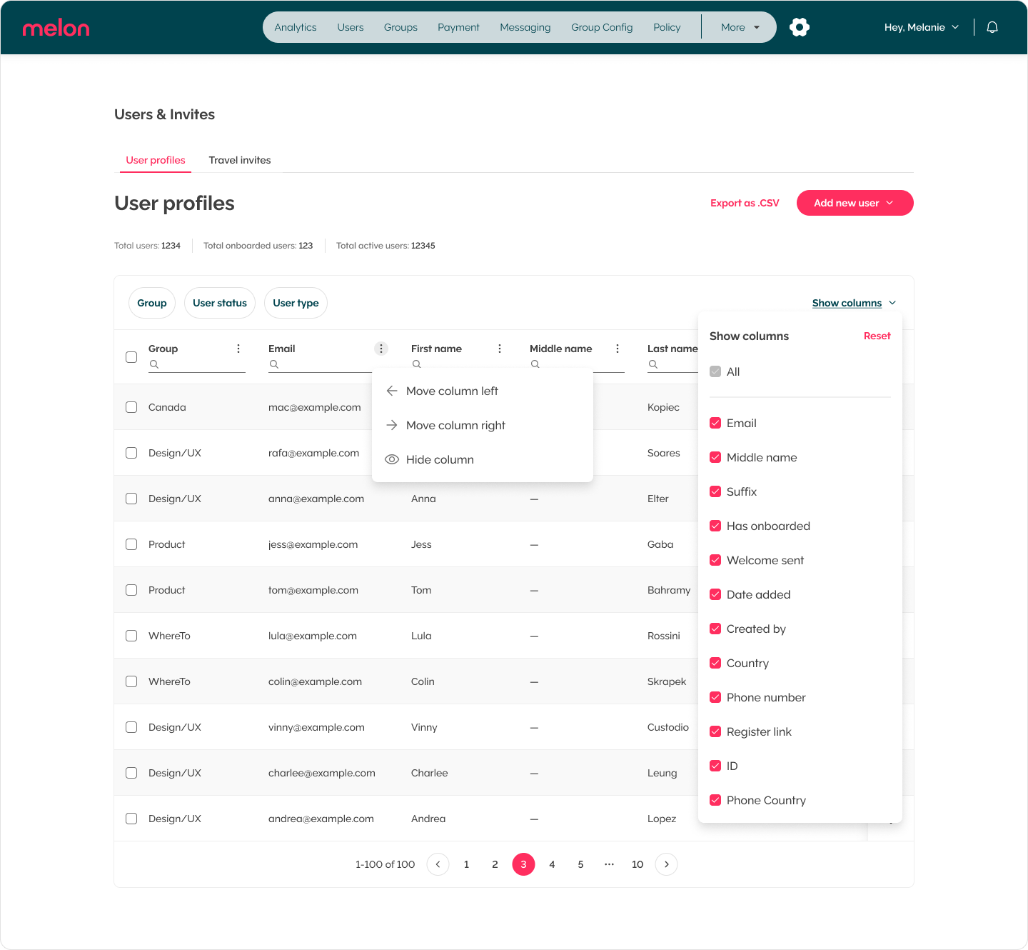
Hide what you don't need. Move what you do.
Personal, flexible, and built for any data load. Columns can be shown, hidden, reordered, and searched, so every team can shape the table around the way they actually work.
A better table, plain & simple.
A table that's actually enjoyable to use. Cleaner, smarter, and accessible, the backbone of our data just got a glow-up, and our users now describe it as intuitive to use.
The backbone of our data just got a glow-up.
Note to self